Would you like to develop clever and effective image ideas? If so, accompany us in this article on a journey to the psychological principles of human perception. We will introduce you to some phenomena in which our brain plays tricks on us and show you the potentials that result for your creative work.
No desire to read? Listen to the blogcast:

As communication experts, we all know how complex (and at the same time fascinating!) the communication process is. A whole universe of decisions must be made to make your creative project intelligent and unique. In addition, comprehensibility plays an important role – because that's what design is all about, isn't it?
In order to make the right decisions, it is worth taking a look at the driving forces behind human perception. After all, a great design, a concept, or an idea should not only be clever, but also make the viewer feel clever. After all, people love to be challenged when reading and interpreting a complex message.
So: Set your neurons in motion!
A true motivational booster: The "Keep up" campaign from Honda.
We all love these little brain teasers – these little intellectual massages. Feels pretty good, doesn't it?
We will now dive into a series of principles that explain the natural thinking processes of humans. At the same time, they will give you a fantastic starting point for creating great designs. And all this based on a sound psychological basis!
D0 y0u kn0w why y0u d0n’t h@ve @ pr0bl3m r3ad!ng th!s wh3n it's t0t@l n0nsense?
Or why do you see a Dalmatian running down here, even though it's just a few moving spots?

The answer to these questions is based on the Gestalt laws of grouping: a set of psychological principles that require people to perceive objects as organized patterns. This happens because the human mind has an innate predisposition to perceive patterns based on certain rules.
The apparent movement generated by a constantly-changing series of images happens because our mind automatically fills in missing information – also known as the Phi phenomenon. And that leads to nothing less than the animation itself.
Why should you learn about Gestalt psychology?
The laws of design can be applied to all creative fields and allow you to connect with your audience on a deep psychological level.
The following design principles will be addressed in this article:
- Principle of figure and reason.
- Principle of similarity.
- Principle of proximity
- Principle of closeness.
- Principle of good course.
- Principle of symmetry.
In just 2 minutes, HubSpot explains the psychology of design.
These principles provide an excellent basis for balanced and professional-looking designs. As with any great passion, "Gestalt Design" is all about discovering the principles, having fun, and trying to see the world from a completely different perspective.
But enough of the long preface: Let's finally take a closer look at the principles of design.
#1 Principle of figure and reason.
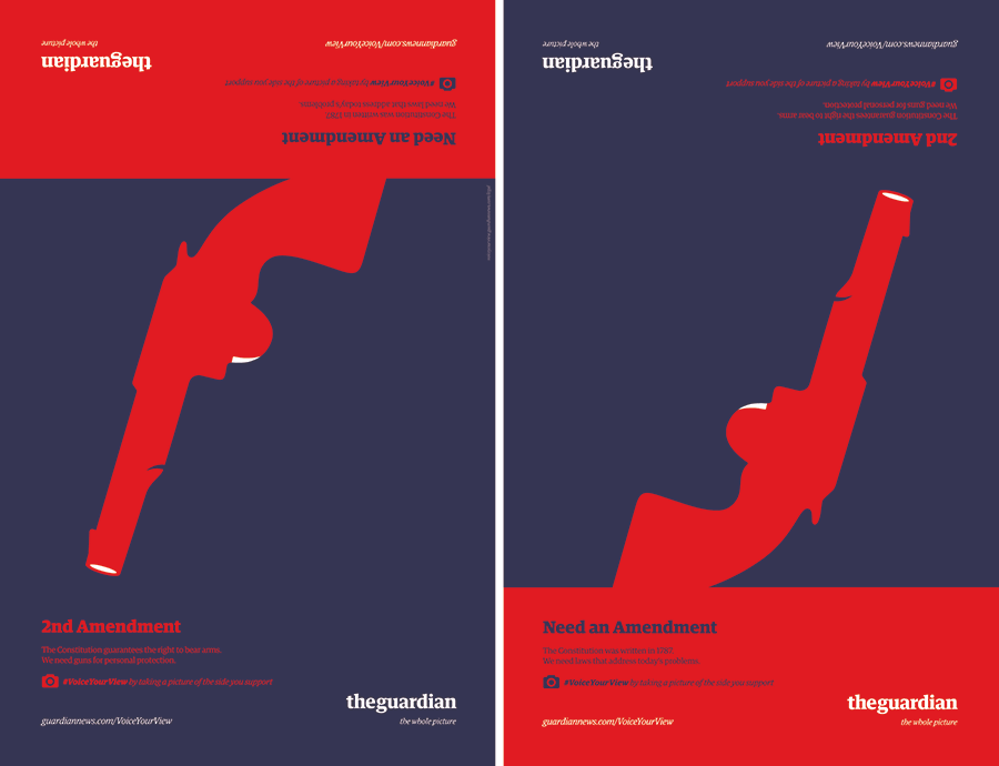
According to Gestalt psychologists, human perception arranges optical sensations into the categories of figure and ground. "The Guardian" presents a "figure and basic design,” which at the same time contains a perspective game. The figure (element in focus) and the ground (background behind the figure) alternate, telling us a completely different story.
 Two completely different statements: The cover of "The Guardian".
#2 Principle of similarity.
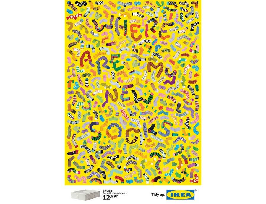
Color, texture, size, orientation, and form: Similarities like these make different objects appear as a whole. The Swedish furniture store IKEA provides our brains with the necessary portion of fun and groups the individual elements into a hidden message.
 Nutzt das Prinzip der Ähnlichkeit: Werbeanzeige von IKEA.
#3 Principle of proximity.
Elements lying close to each other are perceived as a unit. In addition to car tires, this picture shows the face of a panda – a sign of environmental friendliness. This happens because our minds perceive elements close to each other as a whole, while our brains rattle through all the forms we know – until they finally remind us of the face of a panda.

Advertising from the tire manufacturer PIRELLI.
#4 Principle of unity.
We see individual elements as a unit when they are part of a closed form. If we look at the black surfaces, we can watch two guys playing football. Instead, if we look at the negative surface of the design, our brain recognizes the outline of Africa.
 2 pictures in one: This design brings different shapes together.
#5 Principle of flow.
Individual elements are assigned to each other when they are aligned. In this way, different contours are recognized as a coherent figure.
 This design uses the principle of flow: the advertising campaign of GUINNESS.
#6 Principle of symmetry.
Alignment and symmetry are attractive and essential elements of the design. The American film director, producer, and screenwriter Wes Anderson has mastered the secrets of this principle and made order and symmetry his own trademark and an essential part of his visual narrative style.
Axis symmetry: Wes Anderson plays with the principles of Gestalt psychology in his video collage.
What about you? Did you feel inspired by these principles?
Now that you know the rules, you can use them to your advantage and find new ways to take your creative work to the next level.
Appeal to the psychology of your viewers through the principles of similarity, proximity, unity, flow, symmetry, and reason!


