Few people are aware of this, but colours play an extremely important role in today's competitive business environment. For a company to succeed, it must of course have a quality service or product. However, it must also develop and present a unified visual style. This style should contain precisely defined colours that can be effectively distinguish the company’s brand from others.
You must ensure that the colours are effective. See for yourself with this short test:
Can you assign a brand name based on the colour of the logo?
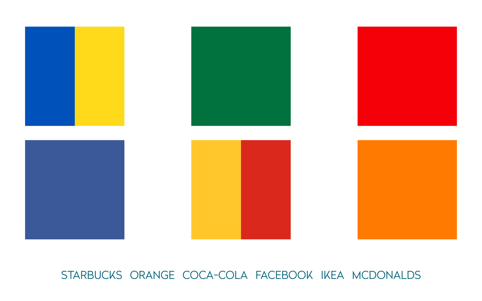
How well did you do? Not as well as you expected, perhaps! Judiciously chosen brand colours should not only be included in the logo, but also in the overall corporate communication which includes the video image of the brand.
But what colours should you choose? When selecting, it’s necessary to discard personal preferences and get to know the psychological effects of each colour.
What exactly is that colour?
Many educated people have been intrigued and puzzled by this question. Books have been written and studies done to discuss and explore this topic. What we can agree is that the perception of colour is a basic human one and that we are constantly exposed to them.
You probably already know that we divide colours into two broad groups:
1. Warm colours: red, orange, yellow and their combinations.
2. Cold colours: green, blue, purple and their combinations.
To these, we could add the neutral colours: white, black, or grey.
Let's start by associating these colours and their use in video marketing.
Colour associations and their use in video marketing
Yellow? The sun. Blue? The sky. These are common associations. Certain colours evoke specific reactions or connections that come from our subconscious. As a result, we often do not realize the association is being made. Each colour thus carries a psychological weight that evokes different feelings or thoughts. This perception of colours also depends on the individual characteristics of the person. To make things more complex, some colours may have different meanings across cultures.
Red
Red belongs to the group of warm colours and is one of the most dynamic colours. It is associated with love, fire, excitement, desire, anger, passion, or danger. Red is energizing, stimulating, and boosts reactions.
The colour red is used in marketing in areas that wish to create a masculine feeling (for sports cars, shaving gels, or cigars, for example) or on fast-moving goods that are bought impulsively (for instance, chocolate, biscuits, or chewing gum). Red has an excellent ability to draw attention to something, which is another reason why it is used on things that warn of something.
Well-known global brands that use red include Coca-Cola, H&M, YouTube, Canon, KFC, Lego, Netflix, Toyota, Adobe and Beyond Eve. As we mentioned in the introduction, these colours must also be used in the brand's online communication. An example is the sponsorship link we created for the Styla shopping centre. In the last scene of the video, the entire image is tinted with their corporate colour to further strengthen the brand connection.
Sponsorship link for the Styla shopping centre
Orange
Another warm colour is orange which combines the properties of yellow and red. It is associated with joy, creativity, cheerfulness, warmth, celebration, or enthusiasm. Orange can generate positive energy and emotions.
In the world of marketing, it is used to arouse a sense of playfulness, generate emotions, or attract attention. We encounter this colour many times on a range of shopping portals because it effectively presents items and events. After all, price tags showing discounts are not orange by chance!
Well-known companies that use orange include ING Bank, Harley-Davidson, Orange, Fanta, MasterCard, and Amazon. The most famous brand of drinks for game players, LevelUp, also makes use of orange. We created an animated video in the Flat style for their product. As you can see, the video does not contain many strong colours, and when they do, these objects are in the company's orange colour:
Explainer video for the LevlUp brand
Yellow
The last in the warm colours group is yellow, which is associated with the sun, cheerfulness, brightness, encouragement, attraction, stability, freedom, energy, or humour. This colour has been found to have a positive effect on memory and supports the desire to discover new things.
In marketing, yellow is also used to generate action and is often linked to the possibility of bargain shopping. Used properly, it can express the prosperity and stability of a brand.
Well-known companies that are characterized by the colour yellow are Ikea, Shell, Nikon, National Geographic, and MailChimp. In Europe, the lesser-known brand Crealogix works very effectively with yellow. We recently created a minimalist video for the company, which is brought to life by the colour yellow. With such consistent communication, the brand ensures easy recognition across various channels on the Internet.
Line-style animated video for Crealogix
Let's plunge into the colder colour waters.
Green
Green is strongly associated with nature, forests, peace, hope, harmony, freshness, freshness, relaxation, or rebirth. It has a calming effect on our minds, inspires confidence, but, conversely, it can generate feelings of envy or inexperience.
You shouldn't be surprised that companies using this colour want to represent themselves as ecological and health-enriching. In the food sector, brands bearing the colour green act as BIO products with a friendlier caloric number or composition.
Spotify, Starbucks, Subway, Sprite, Heineken, WhatsUp, Lacoste, Tic Tac: these are all brands that sport green in their logo
One of a series of explainer videos for the Slovak Environment Agency
Blue
The colour blue is associated with water, cold, the sky, trust, prudence, certainty, quality, sincerity, friendship, and responsibility. It has a calming and cooling effect and enhances perception.
Dark blue is encountered most often at financial and banking institutions because it bolster the sense of success and authority. Conversely, light blue is associated with friendship and open, easy communication. As a result, it is very popular for social portals. Blue is also suitable for brands offering products or services that are associated with water, air, and cleanliness.
In the high-tech segment, the colour blue is linked to accuracy. That's why many of our clients in this industry use this colour. An example is Stonebranch, a company that focuses on the automation of IT processes, for which we created this animated video using blues.
Animated video in using the individual style that explains the processes of automation
Well-known companies that utilise blue include Ford, Intel, Skype, PayPal, Vimeo, Dropbox, Gillette, Nokia, Unicef, and Philips.
Purple
The last colour of the cold shades is purple. Majesty, wisdom, mystery, elegance, subtlety, and humility are things associated with this colour. Psychologically, though, it can evoke a feeling of isolation. However, in combination with white it can have a calming effect.
Purple is especially recommended for brands that are intended for women, children, or teenagers. Are brands already appearing in your head that contain this cool colour? It is, for example, certain chocolate brands, Always, Hallmark, Benq, or Yahoo?
In our studio we have experience with creating video for a brand that has purple as one of the company's colours: Alptracker technology. This product is designed for farmers and ranchers. When creating the video, we used purple as the primary colour in this simple whiteboard video:
Whiteboard video that is animated using the colour purple
Let's talk briefly about neutral colours.
White
The colour white is linked to ideas of purity, lightness, eternity, tenderness, perfection, cold, and peace. In marketing, it combines perfectly with other colours because it recedes and gives them vibrancy and depth. Brands that use white as a complement include Coco Chanel, World Wildlife Fund, Playboy, the BBC, Mac, and Nike.
Black
Black is associated with elegance, seriousness, strength, self-confidence, or prestige. However, it is also connected to death, evil, and sadness. Unlike white, we perceive it as a heavy colour that can cause a negative mood if used in large quantities. Many brands with expensive products use it to emphasize luxury and elegance. Like white, black combines easily with other colours and can make typography stand out. Just think of the logo of Giorgio Armani, Dolce & Gabbana, Adidas, or Prada.
Gray
Neutrality, mediocrity, conservatism, poverty, expressionlessness: these are all associations with grey, a colour that can also engender a sense of despondency or boredom. It is therefore unsuitable for brands that target audiences looking for excitement and adventure. However, with the right colour contrast, it can have an extremely positive effect.
Can you think of brands with a grey logo? How about Apple, Swarovski, Wikipedia, or Mercedes-Benz?
And we're at the end!
Colours have a certain appearance and tone, but they are also linked to subjective experiences. Keep in mind, though, that people are all unique, and, despite the above general associations, there are variations in colour perception. These differences can also be linked to age and gender and impacted on by the individual’s mood or personality. However, in corporate communication, these psychological aspects of the given colours must be considered when designing elements of communication.