Proud of your new video and ready for everyone to see it? For this you need a good, click rate optimized preview image! In this article you will learn everything about the perfect thumbnail.
Jump to the appropriate section:
Definition of a Thumbnail.
Properties of a perfect thumbnail.
Thumbnails for different video styles.
Should you create your own thumbnails or have them created professionally?
Thumbnail presets for social media.
Every minute, 400 hours of video material are uploaded to YouTube worldwide – that's a whole lot of moving pictures. But in order for people to watch YOUR video, it requires a lot of creativity and strategy.
Above all, never neglect: A meaningful, click rate-optimized preview picture, also called "thumbnail".
A click-strong thumbnail: Thanks to the thumbnail, the viewer knows directly what to expect in a given video.
It’s worth investing the time, as often an attractive thumbnail determines a user's click. They are like captivating headlines that encourage a reader to read an article.
But before we present you with tips and tricks for the optimal thumbnail, we must first clarify some concepts.
#1 What exactly is a thumbnail?
A thumbnail is the small preview version of a video. Hence the name: It is about the size of a human thumbnail.
Thumbnails are used on a number of platforms, especially on social media.
On YouTube alone, there are several places where the small pictures appear: such as playlists, in proposed videos, at the end of a played video, on your channel, in the search, or in the mobile app.

Hubspot’s YouTube channel: The thumbnails give a first impression of the videos.
You probably know the saying: "Don't judge a book by its cover.” Honestly? We do it anyway. In the video world, it's similar with thumbnails: They are the first, and often the only impression a user gets of your video. Thus, the thumbnail plays a decisive role in the success of the video. The thumbnail should arouse curiosity, just like a book cover, and thus increase the click rate.
#2 What makes a thumbnail successful?
A thumbnail image, like a book cover, has a number of functions.
The ideal thumbnail should:
- present the content of the video.
- motivate the user to click.
- have a consistent design that fits the represented company.
- look good on all screens.
So how do you adapt these points into a perfect thumbnail? There are several ways to do this.
Integration of text elements.
Text elements in a thumbnail support the video title and give the user a more precise idea of what the video is about.
You should display a maximum of 6 words in a thumbnail – a good idea if you consider that the majority of YouTube users view videos on the go, thus providing a very small area. Please note that Facebook limits the space that text can occupy in your thumbnail to a maximum of 20%.
With this information in mind, you define some meaningful keywords, and display them in your thumbnail – large and bold – to achieve a positive effect in the limited space of the preview image.
Neil Patel shows you how: For his thumbnail, he uses informative, short, legible text.
Your text should summarize the content of your video, appeal to your audience, and arouse curiosity. In the example of Neil Patel, the thumbnail promises tips for top placement in Google search results – who wouldn’t want to find out more?
Tip:
Text in the thumbnail shows a glimpse of what your video is about. But beware: You should not display more than 6 words!
High-contrast colors.
High-contrast, prominent colors create a visual hierarchy in your thumbnail. This means that design elements give the user a focus point and a direction to scan the image and find important information more easily.

Plenty of bright colors: Gary Vee's color mix attracts attention.
Use colors that make your thumbnail stand out from the competition. You can also use a photo editor to enhance the saturation and sharpness of your image.
Especially promising: The color yellow. Statistically, thumbnails containing yellow elements produce better results because they attract more receptors in the human eye.
Tip:
Bright colors stand out. Stand out with contrasting colors in your thumbnail.
Show your face!
Our brain is programmed to recognize faces and viewing directions. By displaying a face in your thumbnail that looks in the desired direction or directly into the camera, you can more easily connect to your audience.
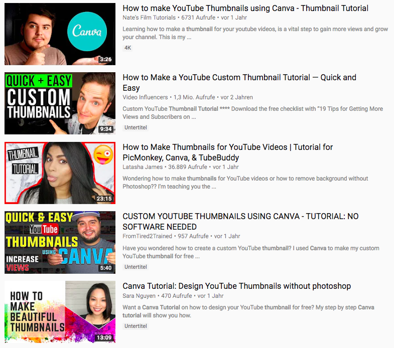
Easier connection to the viewer: The depiction of faces in thumbnails.
You can also use facial expressions to give your viewer a "feel" for your video.

The successful YouTuber Graveyardgirl uses dramatic facial expressions in her thumbnails.
Tip:
Connect to the audience by showing face.
Consistent branding.
As with any type of content you produce, videos are no exception: Consistency is critical.

Consistency thanks to the use of a logo: BBC videos are easy to recognize.
By giving your videos an overall coherent design, be it with filters, colors, lettering, or your logo, you increase the recognition factor for your audience. This way, your video will be more likely to catch their eye in their next search.

Taco Bell creates consistency with its layout, colors, and lettering.
Tip:
Consistency in branding is everything, be it through layout, colors, logo, or lettering.
Design for different sizes.
This point is self-explanatory, but imperative nevertheless: Your thumbnails can be viewed on a number of different screens – from mobile phones to 60 inch televisions.
That's why your design has to be optimized for all sizes. The last thing you want is a pixelated or poorly-cropped thumbnail that creates a negative impression of the quality of your video.
Here is an example from Netflix:

This is what the Netflix video looks like in the desktop version...

... and in the mobile version.
Particularly with logo and text placements, you should keep in mind that your thumbnail may be cropped to accommodate different screens or overlaid with data such as the display time.
Tip:
Remember to optimize your thumbnail for the different screen sizes.
Last but not least: Test it!
Using tools such as TubeBuddy and Vidyard, you can run A/B tests to find out which thumbnail generates more clicks.
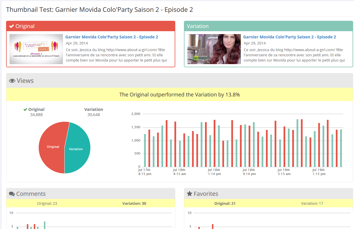
The tool TubeBuddy allows you to compare the performance of different thumbnails.
This can improve the performance of your videos almost immediately – it can prove worthwhile to switch out thumbnails from your older videos, as well.
#3 What are the effects of different video styles?
Strive for a thumbnail that summarizes your content in a meaningful way.
The easiest way, of course, is to quickly take a screenshot of a video scene. However, this can compromise quality: If you pause a video, this usually leads to blurred or strange stills.
With animated explainer videos, "smear" effects are often used to capture a multitude of movements in just one frame. Screenshots are therefore unusable in this case.
Ideally, you should identify a suitable scene and recreate it for the thumbnail as a static version. Headspace successfully uses explainer videos with custom thumbnails in its marketing.
Designed specifically: Headspace uses custom thumbnails that reflect the content of the video.
With product or image films, the problem often lies in the actors' facial expressions: although everything looks great when the video is played, almost every still image results in the strangest facial expressions. Since we are constantly on the move, it’s difficult to get a sharp picture with a screenshot.
Thus, the best approach is to shoot the scene separately and specifically for your thumbnail: This create stills, which grant you full control over the amount of movement and the facial expressions you want to convey in your thumbnail.
Mynd uses a high-quality thumbnail for its image video, which conveys movement and interaction.
No matter which video style it is: Identify and capture a key scene that implies a certain amount of tension and action. If you have your video produced externally, a professional agency with expert knowledge can advise you on the selection of the ideal image.
Tip:
Before shooting or producing your video, think about what your thumbnail should look like. This allows you to photograph, draw, or design the appropriate scenes during shooting.
#4 Is it better to create your own thumbnail or have it created?
Text elements, high-contrast colors, and consistent branding have proven effective for a click-optimized thumbnail.
That means: Design a custom thumbnail in any case, instead of letting the platform select a preview image!
“How do I do that,” you ask yourself? Quite simple: There are Thumbnail Creator Apps for this purpose. In the following, we introduce you to three of the best apps.
Canva.
Canva – one of the world's most popular online design tools, in which the free, basic version has a lot to offer.
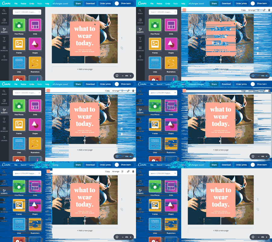
This design tool is extremely intuitive: With Canva, you can get started right away.
Using simple drag & drop, you don't need any previous knowledge to create your custom thumbnail. Depending on the platform, you can select a template that has the correct dimensions or create your own template. Then, upload your graphics and images, or use one of the various free or paid templates.
Pixlr.
Pixlr is available as an app for Android and iOS as well as a web version, and offers a large selection of templates, filters, and editing options. By simply adding overlays, you can customize your thumbnail with Pixlr. Worth mentioning: The clearly-structured user interface!
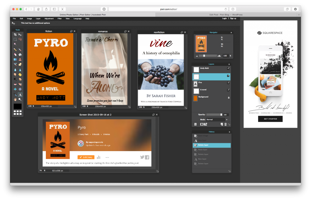
Attractive pictures and great designs in the twinkling of an eye: Pixlr makes it possible.
Snappa.
Snappa makes a particularly ambitious promise: Create YouTube thumbnails in just 60 seconds, for free.
In the integrated library, you will find thousands of royalty-free images that are available for your custom thumbnail. Since the tool is especially designed for creating YouTube thumbnails, you can also start your design with the appropriate dimensions..
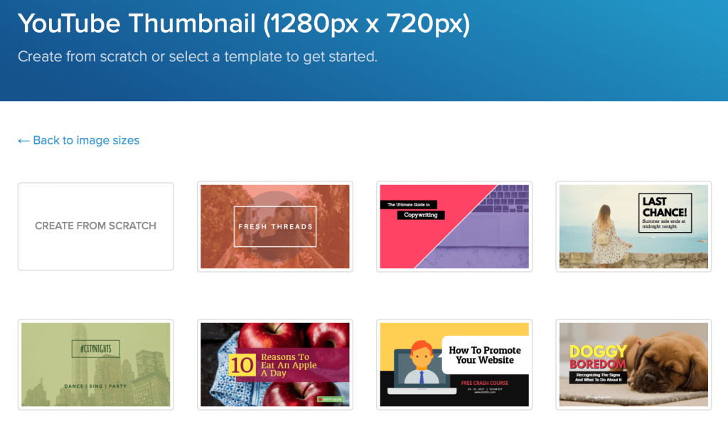
The perfect YouTube thumbnail in just 60 seconds: Snappa offers numerous free templates.
You can find more information and tips on how to create a successful thumbnail in this 15-minute course from the YouTube Creator Academy.
#5 Thumbnails for Social Media: What are the guidelines?
So your video is ready and you've designed a great thumbnail. What now?
Now it's time to upload. It is recommended that you post your video to social media for distribution and ease of embedding, rather than hosting it yourself (on your own web server, for example). For an optimal result, we have summarized the exact specifications for YouTube, Facebook, and Vimeo below.
YouTube.
Nachdem Sie Ihr fertiges Video bei YouTube hochgeladen haben, werden Ihnen drei automatisiert erstellte Vorschläge für Ihr Miniaturbild angezeigt - diese erfüllen kaum die Anforderungen eines spannenden Vorschaubilds. Im nächsten Schritt klicken Sie also auf “Benutzerdefiniertes Thumbnail”.
Once you've uploaded your finished video to YouTube, you'll see three automated suggestions for your thumbnail - hardly an exciting list of options. The next step is to choose "Custom Thumbnail”.
YouTube explains: After video upload, you can select your custom thumbnail.
If this option does not appear on your screen, you must first confirm your account. To do this, click on "Channel" in the Studio menu and on "Confirm" under "Account status.” By entering your telephone number, you will receive a confirmation code. Afterward, the function of the user-defined thumbnail is activated for your account.
Although the thumbnails appear at different locations, there are some general guidelines:
- Resolution: optimum 1280 x 720 pixels, min. 640 pixels wide
- Ratio: 16:9
- Format: JPG, GIF, BMP or PNG
- Size: max. 2 MB
Facebook.
After uploading your video, Facebook automatically selects 10 frames from which you can choose a thumbnail. Here, you have the option to upload your own thumbnail.

Add your own thumbnail when uploading your video to Facebook.
You have to maintain the ratio of your video format (e.g. 1920 x 1080 pixels for a FullHD resolution in 16:9 ratio).
Vimeo.
Vimeo allows much more leeway with the selection of your thumbnail. Click on "Thumbnails" in the video settings, where you can choose between the following options:
- Choose: Scroll frame by frame through your video and select the image you like.
- Random: Let Vimeo select eight random images from your video. If you don't like them, just click again.
- Upload: Upload your custom thumbnail as a file.
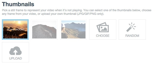
After uploading your video to Vimeo, you can also upload your own thumbnail.
For a custom thumbnail, just follow the following guidelines:
- Resolution: max. 9600 x 5400 pixels, optimally the same dimensions as the video.
- Format: JPG, GIF or PNG.
Now it's your turn!
You have the tools to create your own perfect thumbnail with little effort and some background knowledge, which you gained in this article. Why leave it to chance and hope that YouTube or the platform of your choice makes the most of it?
Happy designing!


